Coloring Buttons w/ ThemeOverlays & Background Tints
Say you want to change the background color of a Button.
How can this be done?
This blog post covers two different approaches. In the first approach,
we’ll use AppCompat’s Widget.AppCompat.Button.Colored style and a custom ThemeOverlay
to modify the button’s background color directly, and in the second, we’ll use
AppCompat’s built-in background tinting support to achieve an identical effect.
Approach #1: Modifying the button’s background color w/ a ThemeOverlay
Before we get too far ahead of ourselves, we should first understand how button background colors are actually determined. The material design spec has very specific requirements about what a button should look like in both light and dark themes. How are these requirements met under-the-hood?
The Widget.AppCompat.Button button styles
To answer this question, we’ll first need a basic understanding of how
AppCompat determines the default appearance of a standard button.
AppCompat defines a number of styles that can be used to alter
the appearance of a button, each of which extend a base
Widget.AppCompat.Button style that is applied to all
buttons by default.1
Specifying a default style to be applied to all views of a certain type is a common technique
used throughout the Android source code. It gives the framework an
opportunity to apply a set of default values for each widget,
encouraging a more consistent user experience. For Buttons, the default
Widget.AppCompat.Button style ensures that:
- All buttons share the same default minimum width and minimum height
(
88dpand48dprespectively, as specified by the material design spec). - All buttons share the same default
TextAppearance(i.e. text displayed in all capital letters, the same default font family, font size, etc.). - All buttons share the same default button background (i.e. same background color, same rounded-rectangular shape, same amount of insets and padding, etc.).
Great, so the Widget.AppCompat.Button style helps ensure that all buttons
look roughly the same by default. But how are characteristics such as the button’s
background color chosen in light vs. dark themes, not only in its normal state, but
in its disabled, pressed, and focused states as well? To achieve this, AppCompat depends mainly on
three different theme attributes:
R.attr.colorButtonNormal: The color used as a button’s background color in its normal state. Resolves to#ffd6d7d7for light themes and#ff5a595bfor dark themes.android.R.attr.disabledAlpha: A floating point number that determines the alpha values to use for disabled framework widgets. Resolves to0.26ffor light themes and0.30ffor dark themes.R.attr.colorControlHighlight: The translucent overlay color drawn on top of widgets when they are pressed and/or focused (used by things like ripples on post-Lollipop devices and foreground list selectors on pre-Lollipop devices). Resolves to 12% black for light themes and 20% white for dark themes (#1f000000and#33ffffffrespectively).
That’s a lot to take in for something as simple as changing the background
color of a button! Fortunately, AppCompat handles almost everything for us behind the scenes
by providing a second Widget.AppCompat.Button.Colored
style that makes altering the background color of a button relatively easy.
As its name suggests, the style extends Widget.AppCompat.Button and thus
inherits all of the same attributes with one notable exception: the
R.attr.colorAccent
theme attribute determines the button’s base background color instead.
Creating custom themes using ThemeOverlays
So now we know that button backgrounds can be customized using the
Widget.AppCompat.Button.Colored style, but how should we go about customizing the
theme’s accent color? One way we could
update the color pointed to by the R.attr.colorAccent theme attribute is by modifying the
application’s theme directly. However, this is rarely desirable since most of the
time we only want to change the background color of a single button in our app.
Modifying the theme attribute at the application level will change the
background color of all buttons in the entire application.
Instead, a much better solution is to assign the button its own custom theme in
XML using android:theme and a ThemeOverlay. Let’s say we want to change the button’s background
color to Google Red 500. To achieve this, we can define the following theme:
<!-- res/values/themes.xml -->
<style name="RedButtonLightTheme" parent="ThemeOverlay.AppCompat.Light">
    <item name="colorAccent">@color/googred500</item>
</style>
…and set it on our button in the layout XML as follows:
<Button
    style="@style/Widget.AppCompat.Button.Colored"
    android:layout_width="wrap_content"
    android:layout_height="wrap_content"
    android:theme="@style/RedButtonLightTheme"/>
And that’s it! You’re probably still wondering what’s up with that weird
ThemeOverlay though. Unlike the themes we use in our AndroidManifest.xml
files (i.e. Theme.AppCompat.Light, Theme.AppCompat.Dark, etc.),
ThemeOverlays define only a small set of material-styled theme attributes that
are most often used when theming each view’s appearance (see the
source code for a complete list of these attributes).
As a result, they are very useful in cases where you only want to modify one or
two properties of a particular view: just extend the ThemeOverlay, update the
attributes you want to modify with their new values, and you can be sure that
your view will still inherit all of the correct light/dark themed values that
would have otherwise been used by default.2
Approach #2: Setting the AppCompatButton’s background tint
Hopefully you’ve made it this far in the post, because you’ll be happy to know that
there is an even more powerful
way to color a button’s background using a relatively new feature in AppCompat known as
background tinting. You probably know that AppCompat injects its own widgets in
place of many framework
widgets, giving AppCompat greater control over tinting widgets according to the material design
spec even on pre-Lollipop devices. At runtime, Buttons become AppCompatButtons,
ImageViews become AppCompatImageViews, CheckBoxs become AppCompatCheckBoxs,
and so on and so forth. What you may not know is that any
AppCompat widget that implements the TintableBackgroundView
interface can have its background tint color changed by declaring a ColorStateList:
<!-- res/color/btn_colored_background_tint.xml -->
<selector xmlns:android="http://schemas.android.com/apk/res/android">

    <!-- Disabled state. -->
    <item android:state_enabled="false"
          android:color="?attr/colorButtonNormal"
          android:alpha="?android:attr/disabledAlpha"/>

    <!-- Enabled state. -->
    <item android:color="?attr/colorAccent"/>

</selector>
…and either setting it in the layout XML:
<android.support.v7.widget.AppCompatButton
    android:layout_width="wrap_content"
    android:layout_height="wrap_content"
    app:backgroundTint="@color/btn_colored_background_tint"/>
…or programatically via the
ViewCompat#setBackgroundTintList(View, ColorStateList)
method:3
final ColorStateList backgroundTintList =
    AppCompatResources.getColorStateList(context, R.color.btn_colored_background_tint);
ViewCompat.setBackgroundTintList(button, backgroundTintList);
While this approach to coloring a button is much more powerful in the sense that it can be
done entirely programatically (whereas ThemeOverlays must be defined in XML and cannot
be constructed at
runtime), it also requires a bit more work on our end if we want to ensure our button exactly meets
the material design spec. Let’s create a simple BackgroundTints utility class that makes
it quick and easy to construct colored background tint lists:
/**
 * Utility class for creating background tint {@link ColorStateList}s.
 */
public final class BackgroundTints {
  private static final int[] DISABLED_STATE_SET = new int[]{-android.R.attr.state_enabled};
  private static final int[] PRESSED_STATE_SET = new int[]{android.R.attr.state_pressed};
  private static final int[] FOCUSED_STATE_SET = new int[]{android.R.attr.state_focused};
  private static final int[] EMPTY_STATE_SET = new int[0];

  /**
   * Returns a {@link ColorStateList} that can be used as a colored button's background tint.
   * Note that this code makes use of the {@code android.support.v4.graphics.ColorUtils}
   * utility class.
   */
  public static ColorStateList forColoredButton(Context context, @ColorInt int backgroundColor) {
    // On pre-Lollipop devices, we need 4 states total (disabled, pressed, focused, and default).
    // On post-Lollipop devices, we need 2 states total (disabled and default). The button's
    // RippleDrawable will animate the pressed and focused state changes for us automatically.
    final int numStates = Build.VERSION.SDK_INT < Build.VERSION_CODES.LOLLIPOP ? 4 : 2;

    final int[][] states = new int[numStates][];
    final int[] colors = new int[numStates];

    int i = 0;

    states[i] = DISABLED_STATE_SET;
    colors[i] = getDisabledButtonBackgroundColor(context);
    i++;

    if (Build.VERSION.SDK_INT < Build.VERSION_CODES.LOLLIPOP) {
      final int highlightedBackgroundColor = getHighlightedBackgroundColor(context, backgroundColor);

      states[i] = PRESSED_STATE_SET;
      colors[i] = highlightedBackgroundColor;
      i++;

      states[i] = FOCUSED_STATE_SET;
      colors[i] = highlightedBackgroundColor;
      i++;
    }

    states[i] = EMPTY_STATE_SET;
    colors[i] = backgroundColor;

    return new ColorStateList(states, colors);
  }

  /**
   * Returns the theme-dependent ARGB background color to use for disabled buttons.
   */
  @ColorInt
  private static int getDisabledButtonBackgroundColor(Context context) {
    // Extract the disabled alpha to apply to the button using the context's theme.
    // (0.26f for light themes and 0.30f for dark themes).
    final TypedValue tv = new TypedValue();
    context.getTheme().resolveAttribute(android.R.attr.disabledAlpha, tv, true);
    final float disabledAlpha = tv.getFloat();

    // Use the disabled alpha factor and the button's default normal color
    // to generate the button's disabled background color.
    final int colorButtonNormal = getThemeAttrColor(context, R.attr.colorButtonNormal);
    final int originalAlpha = Color.alpha(colorButtonNormal);
    return ColorUtils.setAlphaComponent(
        colorButtonNormal, Math.round(originalAlpha * disabledAlpha));
  }

  /**
   * Returns the theme-dependent ARGB color that results when colorControlHighlight is drawn
   * on top of the provided background color.
   */
  @ColorInt
  private static int getHighlightedBackgroundColor(Context context, @ColorInt int backgroundColor) {
    final int colorControlHighlight = getThemeAttrColor(context, R.attr.colorControlHighlight);
    return ColorUtils.compositeColors(colorControlHighlight, backgroundColor);
  }

  /** Returns the theme-dependent ARGB color associated with the provided theme attribute. */
  @ColorInt
  private static int getThemeAttrColor(Context context, @AttrRes int attr) {
    final TypedArray array = context.obtainStyledAttributes(null, new int[]{attr});
    try {
      return array.getColor(0, 0);
    } finally {
      array.recycle();
    }
  }

  private BackgroundTints() {}
}
Using this class, we can then simply apply the background tint to the button programatically using:
ViewCompat.setBackgroundTintList(
    button, BackgroundTints.forColoredButton(button.getContext(), backgroundColor);
Pop quiz!
Let’s test our knowledge of how this all works with a simple example.
Consider a sample app that sets the following theme in its AndroidManifest.xml:
<!-- res/values/themes.xml -->
<style name="AppTheme" parent="Theme.AppCompat.Light.DarkActionBar">
    <item name="colorPrimary">@color/indigo500</item>
    <item name="colorPrimaryDark">@color/indigo700</item>
    <item name="colorAccent">@color/pinkA200</item>
</style>
In addition to this, the following custom themes are declared as well:
<!-- res/values/themes.xml -->
<style name="RedButtonLightTheme" parent="ThemeOverlay.AppCompat.Light">
    <item name="colorAccent">@color/googred500</item>
</style>

<style name="RedButtonDarkTheme" parent="ThemeOverlay.AppCompat.Dark">
    <item name="colorAccent">@color/googred500</item>
</style>
What will the following XML look like in the on API 19 and API 23 devices when the buttons are put in default, pressed, and disabled states?
<LinearLayout
    android:layout_width="match_parent"
    android:layout_height="wrap_content"
    android:orientation="vertical">

    <Button
        android:layout_width="wrap_content"
        android:layout_height="wrap_content"/>

    <Button
        style="@style/Widget.AppCompat.Button.Colored"
        android:layout_width="wrap_content"
        android:layout_height="wrap_content"/>

    <Button
        style="@style/Widget.AppCompat.Button.Colored"
        android:layout_width="wrap_content"
        android:layout_height="wrap_content"
        android:theme="@style/RedButtonLightTheme"/>

    <Button
        android:id="@+id/button4"
        android:layout_width="wrap_content"
        android:layout_height="wrap_content"/>

    <Button
        android:layout_width="wrap_content"
        android:layout_height="wrap_content"
        android:theme="@style/ThemeOverlay.AppCompat.Dark"/>

    <Button
        style="@style/Widget.AppCompat.Button.Colored"
        android:layout_width="wrap_content"
        android:layout_height="wrap_content"
        android:theme="@style/ThemeOverlay.AppCompat.Dark"/>

    <Button
        style="@style/Widget.AppCompat.Button.Colored"
        android:layout_width="wrap_content"
        android:layout_height="wrap_content"
        android:theme="@style/RedButtonDarkTheme"/>

    <Button
        android:id="@+id/button8"
        android:layout_width="wrap_content"
        android:layout_height="wrap_content"
        android:theme="@style/ThemeOverlay.AppCompat.Dark"/>

</LinearLayout>
Assume that background tints are set programatically on the 4th and 8th buttons as follows:
final int googRed500 = ContextCompat.getColor(activity, R.color.googred500);

final View button4 = activity.findViewById(R.id.button4);
ViewCompat.setBackgroundTintList(
    button4, BackgroundTints.forColoredButton(button4.getContext(), googRed500));

final View button8 = activity.findViewById(R.id.button8);
ViewCompat.setBackgroundTintList(
    button8, BackgroundTints.forColoredButton(button8.getContext(), googRed500));
Solutions
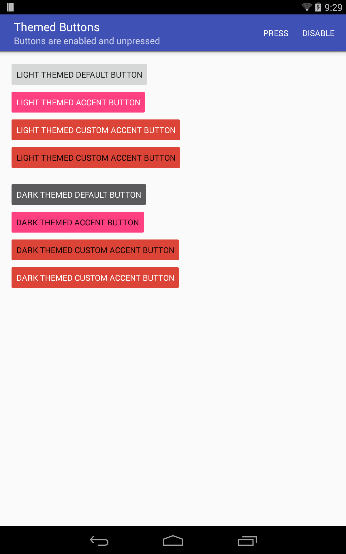
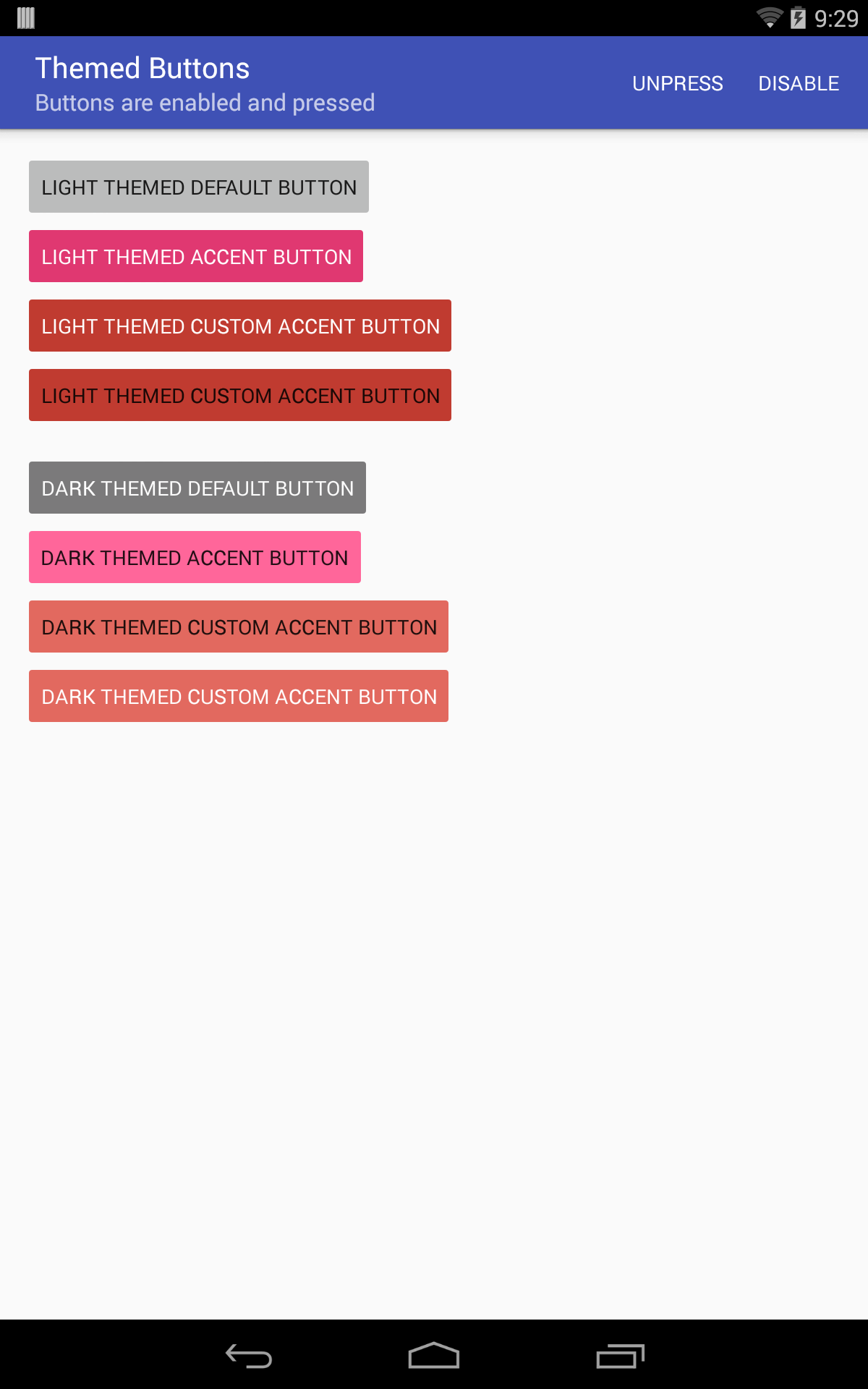
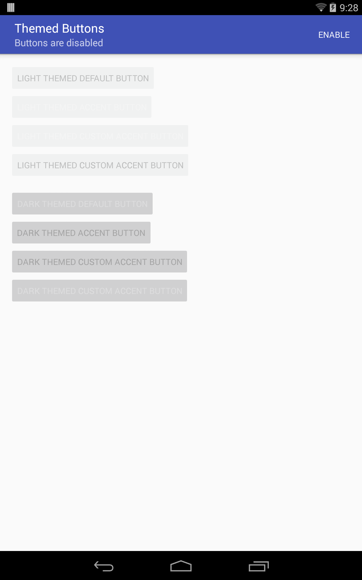
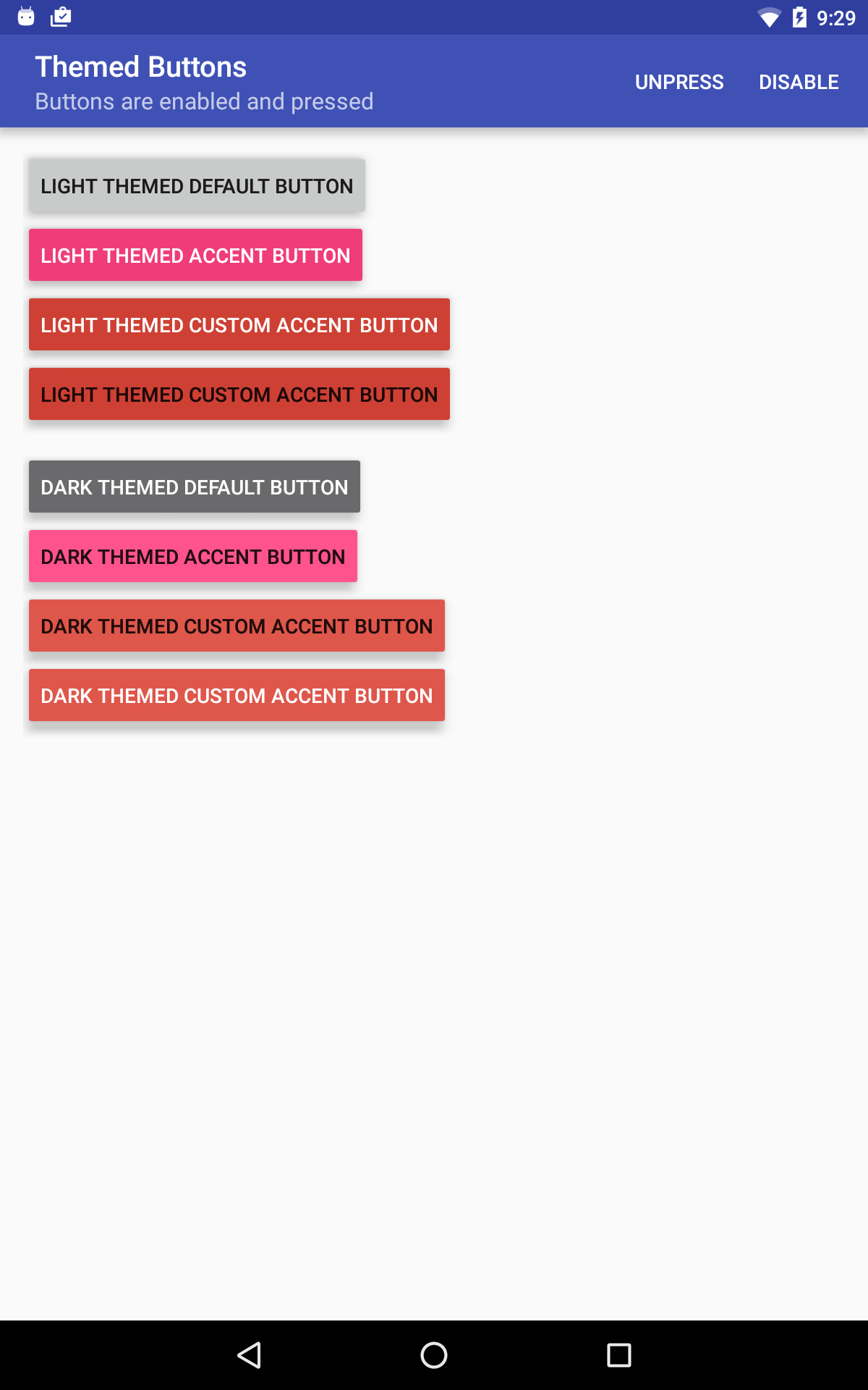
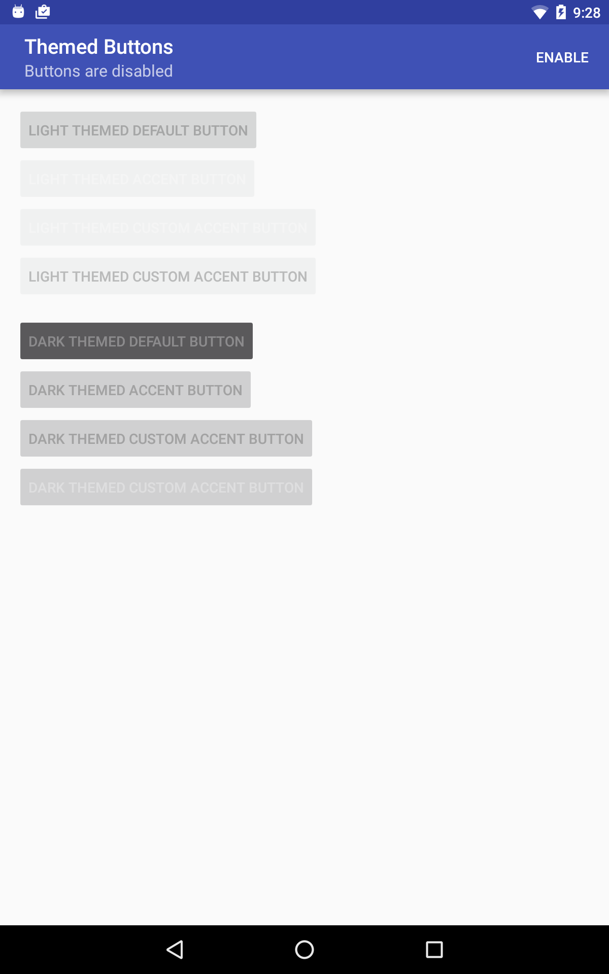
See the below links to view screenshots of the solutions:
- API 19, default state
- API 19, pressed state
- API 19, disabled state
- API 23, default state
- API 23, pressed state
- API 23, disabled state
(Note that the incorrect disabled text color in the screenshots is a known issue and will be fixed in an upcoming version of the support library.)
As always, thanks for reading! Feel free to leave a comment if you have any questions, and don’t forget to +1 and/or share this blog post if you found it helpful! And check out the source code for these examples on GitHub as well!
1 Just in case you don’t believe me, the default style applied to an AppCompatButtons
is the style pointed to by the R.attr.buttonStyle theme attribute, which points to the
Widget.AppCompat.Button style here. Check out
Dan Lew’s great blog post for more information about default styles in
Android. ↩
2 ThemeOverlays aren’t only useful for changing your
theme’s accent color. They can be used to alter any theme attribute you want!
For example, you could use one to customize the
color of an RecyclerView’s overscroll ripple by modifying the color of the
android.R.attr.colorEdgeEffect theme
attribute. Check out this Medium post and this
Google+ pro tip for more information
about ThemeOverlays. ↩
3 Note that AppCompat widgets do not expose a setBackgroundTintList()
methods as part of their public API. Clients must use the ViewCompat#setBackgroundTintList()
static helper methods to modify background tints programatically. Also note that using the
AppCompatResources
class to inflate the ColorStateList is important here. Check out my previous blog post
for more detailed information on that
topic. ↩
